Landing Page Teardown: What Indie Builders Get Wrong (And How to Fix It)
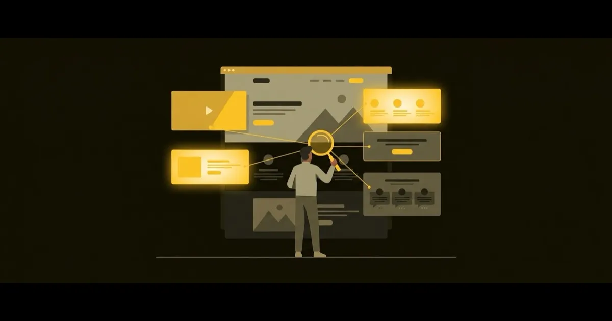
A landing page teardown is one of the fastest ways to figure out why visitors aren't converting. You look at your page section by section, spot the weak points, and fix them. No guesswork, no expensive consultants.
Most indie builders spend weeks building their product and 45 minutes on their landing page. Then they wonder why nobody signs up. Let's fix that.
How to Do Your Own Landing Page Teardown
Grab your landing page and score each section below on a scale of 1-5. Be honest. If you can't be objective, ask a builder friend to do it for you.
1. The Hero Section (Above the Fold)
This is where most pages fail. Check for:
- Clear headline: Does it say what you do in 8 words or fewer?
- Specific subheadline: Does it explain who it's for and what outcome they get?
- Visible CTA: Can someone sign up without scrolling?
- No jargon: Would a stranger understand this in 5 seconds?
Common mistake: Leading with features instead of the problem you solve. "AI-powered workflow automation" means nothing. "Ship your side project 2x faster" means everything.
2. Social Proof
You don't need 10,000 customers. You need one credible signal. Options for early-stage builders:
- A tweet from a real user saying something specific
- "Used by 47 builders" (real numbers beat vague claims)
- A short case study or before/after result
- Logos of communities you're part of (Indie Hackers, Product Hunt)
Common mistake: Skipping social proof entirely because you think you need more traction first. Even "Built by the maker of [previous project]" counts.
3. The Problem Statement
Before showing features, name the pain. Your visitor should think "yes, that's exactly my problem" within the first scroll.
- Use their words, not yours. Pull language from Reddit threads, tweets, or support emails.
- Be specific. "Marketing is hard" is weak. "You built something great but nobody knows it exists" hits different.
4. Features and Benefits
Every feature should answer: "So what?"
- Bad: "Integrates with Slack"
- Good: "Get notified in Slack the moment a new lead signs up"
Limit yourself to 3-4 features. More than that and visitors won't remember any of them.
5. The CTA (Again)
Repeat your call to action at least twice on the page. Once above the fold, once at the bottom. Make the button text specific:
- Weak: "Get started"
- Better: "Start your free audit"
- Best: "See what's wrong with your distribution in 2 minutes"
Real Landing Page Teardown Example
Here's what a quick teardown looks like in practice. Take a typical indie builder page:
- Hero: "The All-in-One Platform for Creators". Score: 2/5. Too vague. Which creators? What does it do?
- Social proof: None. Score: 1/5.
- Problem: Jumps straight to features. Score: 1/5.
- Features: Lists 8 features with no context. Score: 2/5.
- CTA: "Sign Up" button in light gray. Score: 2/5.
Total: 8/25. This page is losing most of its visitors. But every issue is fixable in an afternoon.
The Teardown Checklist
Run through this before you ship or update your page:
- Headline says what you do, not what you are
- Subheadline names the target user and their desired outcome
- At least one piece of social proof is visible
- Problem is stated before the solution
- Features are framed as benefits
- CTA appears above the fold and below the fold
- Page loads in under 3 seconds
- Works on mobile (actually check it on your phone)
Your Page Is Only Half the Problem
A landing page teardown fixes your conversion. But if the wrong people are landing on your page in the first place, even a perfect page won't save you. Most indie builders have a distribution problem, not a conversion problem.
Want to find out where YOUR users actually are? Try the free Stride audit